Writing on the ground
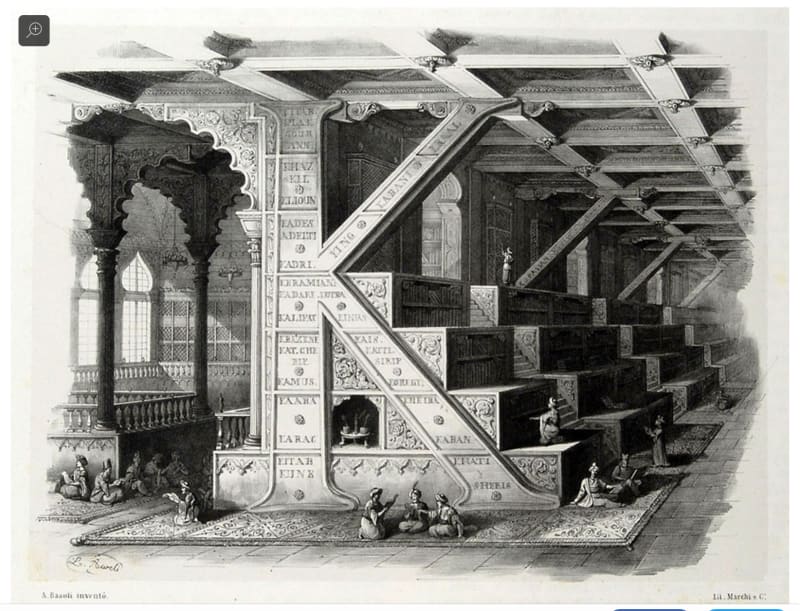
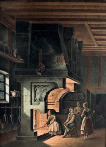
Artists and illustrators have been fascinated by resemblances between the forms of buildings and the shapes of letters, and have made images of alphabetical buildings. The Italian artist Antonio Basoli published engraved perspectives of elaborately decorated structures in his *Alfabeto Pittorico *of 1839, in which the letters are worked into the buildings’ elevations and sections. His B is a dramatic Tower of Babel struck by lightning. His letter K supports the roof of what seems to be an oriental library of books by authors whose names begin with K, in shelves on wide steps. A few years later Jean Baptiste de Pian published 26 hand-coloured lithographs in the same spirit as Basoli. De Pian has two Fs supporting a large Fireplace. His O is made from the round arch of a bridge, the letter completed by the arch’s reflection in the water.
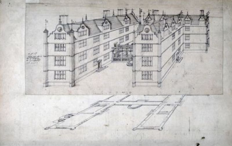
Architects have explored the possibilities for making buildings with *plans *in the shapes of letters. The first to do this seems to have been John Thorpe in the 16th century. Thorpe designed a country house for himself consisting of two pavilions linked by an open arcade, whose plans take the shape of his (Latinized) initials I T. His perspective of the scheme is now in the Soane Museum in London. (Thorpe deserves to be remembered otherwise by his introduction of the corridor into architecture.)
In the 1780s F Roppert designed a Jesuit College with three blocks whose plans spelled IHS, the first three letters of the name of Jesus in Greek. The 18th century French architect Thomas Gobert wrote a text dedicated to Louis XIV, in which he included a set of plans spelling out the King’s name LOVIS LE GRAND. It is a little difficult to read this at first, until one realises that Gobert, an architectural classicist, has been unable to countenance the idea of an asymmetrical plan, and has mirrored those letters that lack bilateral symmetry.
The most romantic of these ‘writings on the ground’ was conceived by Edwin Lutyens when he was wooing Lady Emily Lytton in 1896. He presented her with an elaborately decorated casket covered in green leather. This contained several gifts including a set of miniature drawings of ‘The Little White House’ that he promised to build for her. The house had a plan in the shape of the combined letters E L – the initials they shared. Emily agreed to marry Edwin. But he never built her the house.
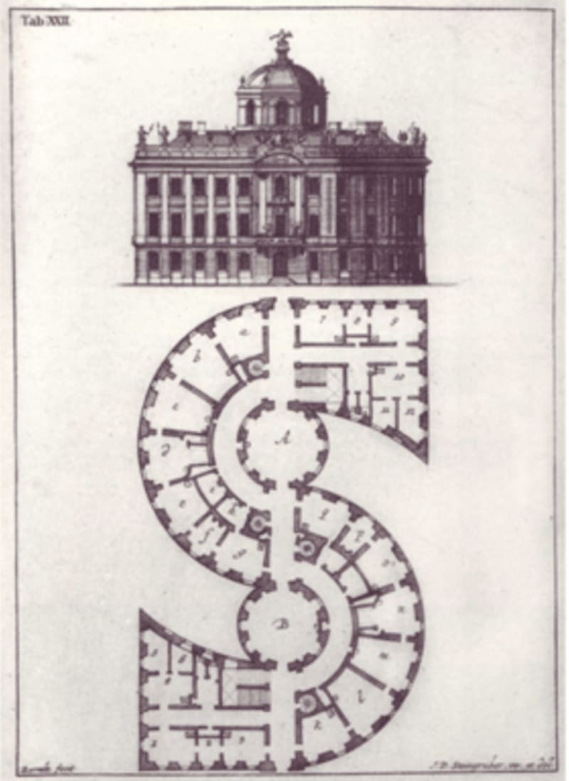
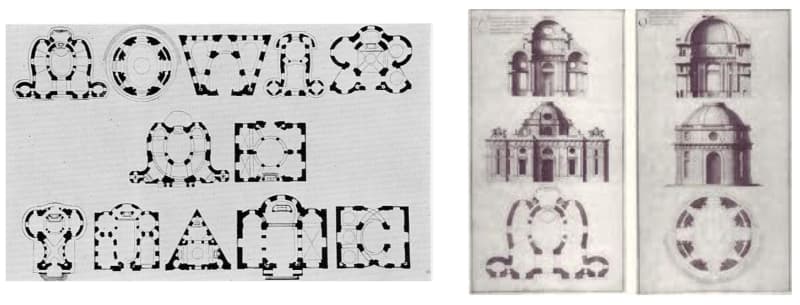
The most elaborate of all architectural alphabets was designed by the German architect Johann David Steingruber and published in 1773. Each of Steingruber’s 26 capital letters is a fully worked out scheme for a country house or palace. All are assembled from straight or curving ranges in which the rooms are placed along one or both sides of long corridors. For letters where the ranges meet at acute angles like K, N or V, Steingruber puts closets and staircases at the junctions. He has more difficulties with curved shapes. His Q is a virtuoso exercise in which the main entrance is through the letter’s tail. He says of his S, on the other hand, that “To erect a building according to this letter form is to create, as none will gainsay, a curiosity rather than a workable building.”
How is it that the plans of buildings can so readily be given the shapes of letters? As buildings are made larger, and if natural light is needed throughout, their plans must be stretched out into elongated ranges and wings – as in Steingruber’s houses - so that all the rooms can have windows. Such plans can be at a maximum two rooms deep: if there are more than two rooms across the plan, then those at the centre cannot be lighted.
Like large daylit plans, letter-forms are also assembled from straight or curving linear elements, the pen strokes, joined together in different configurations. For small numbers of elements, there is only a limited number of possible configurations in both cases, for plans or for letters. This fact is exploited in the luminous displays that show figures or numbers on old pocket calculators or petrol pumps. The display consists of seven bars arranged in two squares. By lighting two or more bars, the shapes of all nine digits and most of the letters of the alphabet can be approximated. (K, M, Q and W present problems.) Only a few of the possible arrangements in which the lights make a single connected shape do not correspond to letters or numbers.
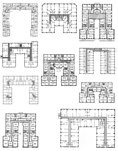
In his book *The Alphabetical City *the American architect Steven Holl reproduces photos and birds’ eye views of buildings with letter plans. These are mostly late 19th and early 20th century office, hotel and apartment buildings in the centres of American cities, which fill their rectangular sites completely. Their outlines in plan are therefore constrained by their site boundaries. Again these are buildings which, at this date, are dependent on natural light and natural ventilation. In the interiors of their sites there are courtyards and lightwells in different configurations. The result is to produce plans – as classified by Holl – of E, F, H, I, T and X shapes. There can also be squared-up U (or C) shapes. Plans with one or two courts can be seen as squared-up Os and Bs. Holl describes his book as “part of a search for elements, or ABCs, of a modern urban architecture.”
On larger sites, combinations of letters are possible. Holl has several examples including an hotel whose plan is made up in effect from two Es and an A, and an office for General Motors with a plan consisting of three Hs in line. None however spells out a meaningful message.
Werner Oechslin, ‘Architecture and alphabet’, *Via *Vol.8 1986 pp.96-125
Johann David Steingruber, Architectonisches Alphabeth, Mizler, Schwabach 1773: translated by E M Hatt as Architectural Alphabet, Merrion Press, London 1972
Steven Holl, The Alphabetical City, Pamphlet Architecture #5, Pamphlet Architecture Ltd and William Stout Architectural Books, New York and San Francisco 1980